there is something about attending signings by people whose work you respect. although in many ways you may feel as if you've out-grown teenage awkwardness, when facing some artists you turn into a bumbling 15 year-old, or even an over-eager pup. in theory there is nothing that should cause this unease: on paper you share a taste in comics, philosophy, music and sense of humour. in the flesh however things work differently.
here is someone who has been on the road for weeks, stuck behind a table, signing and drawing and having to be pleasant to every single person that shows up in front of them. a queue of forced conversation and small talk. and as a punter you queue, sometimes for a very long time, to try and connect with someone who you might feel you know, but who of course you don't.
it is a very peculiar power balance. there are difficult to meet expectations, because how much can you say in the two or three minutes it takes to sign a book and make a doodle? if you haven't brought along your entire library of course, something i'd be embarrassed to do. and who cares about a signature, really?
tom, anders, the millenium falcon and a redhead
tom gauld and
anders nilsen were at
orbital tonight as part of paul gravett's
comica festival. the conversation didn't quite flow the way you might expect between friends, but i found myself taking notes. they discussed influences in comics and in literature: chester brown, john porcelino, jason lutes and pär lagerkvist (barabbas) and c.s. lewis (till we have faces) for anders. for tom it was edward gorey, john le carré and magnus mills. the latter for the flatness of his writing and his 'confused men doing pointless things'. they also spoke about the act of drawing, something which was of particular interest. anders mentioned the 'faking' that can creep into your drawing when you've been drawing as long as he has. he regretted not having drawn an actual type of plane in big questions instead of the more generic plane he drew or 'faked'. then there were the birds in his book, which he kept purposefully simple. he experimented with different details to distinguish them from each other, but decided that details were too much for such simple drawings. tom said he does a lot of visual research, but he uses this as inspiration. what interests him is drawing what something does rather than what it looks like. scientific and anatomical drawings were mentioned and so were the
lewis chessmen at the british museum. i have lots more notes not to mention thoughts on everything that was discussed, but the word picture ratio of this post is already lopsided. if you're still hungry check out some interviews
here and
here.

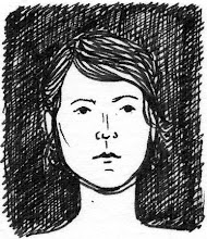
detail from suster bertken
i also attended anders' signing and talk at gosh on saturday and unfortunately acted as described in the first paragraph of this post. after tonight's talk all i did was push some comics into his hands and legged it. i managed to finish my story for
the strumpet today and quickly made it into a stand alone mini too, so anders may be the first person to read it.
suster bertken-mini mock up
in spite of all the weirdness that seems part and parcel of signings i had a wonderful time at both tonight's and saturday's events. anders and tom were lovely. and on both nights i bumped into or met some great people: morgan omotoye,
rose robbins,
barnaby richards and
jessica penfold amongst others.